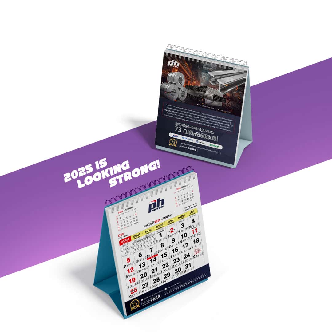
Building upon the foundational branding work for PH Metals, we extended their visual identity across essential corporate materials. This encompassed the meticulous design of their 2025 calendar and diary, alongside the development of a professional letterhead and distinct visiting cards.
Each of these items was crafted to ensure consistency with the established brand guidelines, maintaining the cohesive image we developed. The 2025 calendar and diary were designed not just for utility, but as brand touchpoints, featuring the new color palette and typography to reinforce brand recognition throughout the year. Similarly, the letterhead and visiting cards were developed to project an image of professionalism and unwavering quality, serving as tangible representations of PH Metals’ commitment to excellence in every interaction.